How I redesigned UNUM for major app growth.
This is some text inside of a div block.


Some closing message
Your Website Is Getting Traffic But No Leads: Why AI-Built Sites Stop Converting
Your AI site got you live — here’s why it isn’t closing.

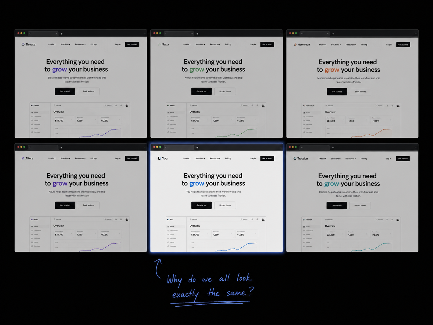
It Looks Like Every Other Site in Your Category
You launched fast. That was the right call. Tools like Framer, Lovable, and v0 exist for exactly that reason — to get you live before the window closes. And they delivered. Your site is up, it looks clean, and people are finding it.
But here’s what those tools can’t give you: a point of view.
AI builders pull from the same pool of design patterns. The same hero layouts. The same gradient buttons. The same three-column feature grids. When every tool trains on the same data, every output looks like a variation of the same site. That’s fine when you’re the only option in the room. It’s a serious problem when you’re one of twenty.
Visitors make trust decisions in under three seconds. If your site looks like your competitor’s site — same structure, same vibe, same stock-feeling energy — there’s no reason to stay. Not because your product is worse. Because nothing on the page told them it’s different.
Generic doesn’t just hurt conversions. It makes you forgettable. And forgettable doesn’t close.
It Was Designed to Exist, Not to Convert
AI builders are very good at one thing: producing a site that looks like a site. Hero section, features, pricing, footer. It checks every box on the “does this look legitimate” checklist. What it doesn’t do is think about what your visitor is feeling at each step — and what they need to see to take action.
A site that converts is a sequence. It moves someone from “what is this?” to “I trust this” to “I’m ready to act” — and it does it deliberately. Every section has a job. Every line of copy is there to answer an objection or remove a doubt. The CTA isn’t just bolted on at the end; it’s the destination the whole page was pointing toward.
AI doesn’t know your customer. It doesn’t know the objection that kills 80% of your deals on the first call, or the one sentence from a happy client that makes new visitors lean in. It generates structure. It doesn’t generate strategy.
The result is a site that exists but doesn’t pull. People land, look around, and leave — not because they weren’t interested, but because nothing on the page gave them a reason to stay.
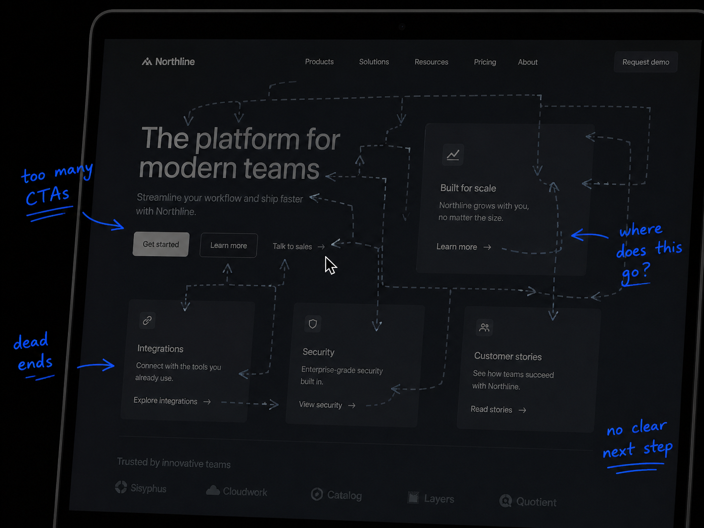
It Can’t Tell Visitors Why to Choose You
This is the one that stings, because it’s the most fixable — and the most overlooked.
Ask yourself: if someone landed on your homepage right now and read nothing but the headline, would they know what you do, who it’s for, and why you over anyone else? Most AI-built sites answer the first question, partially answer the second, and skip the third entirely.
“Why you” is a brand question. It comes from knowing your best customers, understanding what made them choose you, and building a message around that truth. It’s not a tagline. It’s a through-line — in the copy, the visuals, the case studies, even the way you describe what you do. AI can generate words that sound right. It can’t generate the insight behind them.
When that clarity is missing, visitors feel it even if they can’t name it. The site looks professional but somehow doesn’t land. They move on. They might come back if they remember you. Most don’t.
The fix isn’t more content or a new color palette. It’s a sharper answer to the question every visitor is silently asking: why you?

Ready to Find Out What’s Costing You Leads?
Not sure which of these is the issue — or if it’s all three? We can pinpoint the exact problem with your site and show you what to fix in a free 15-minute audit. No pitch, no pressure. Just a clear answer.
