About the author

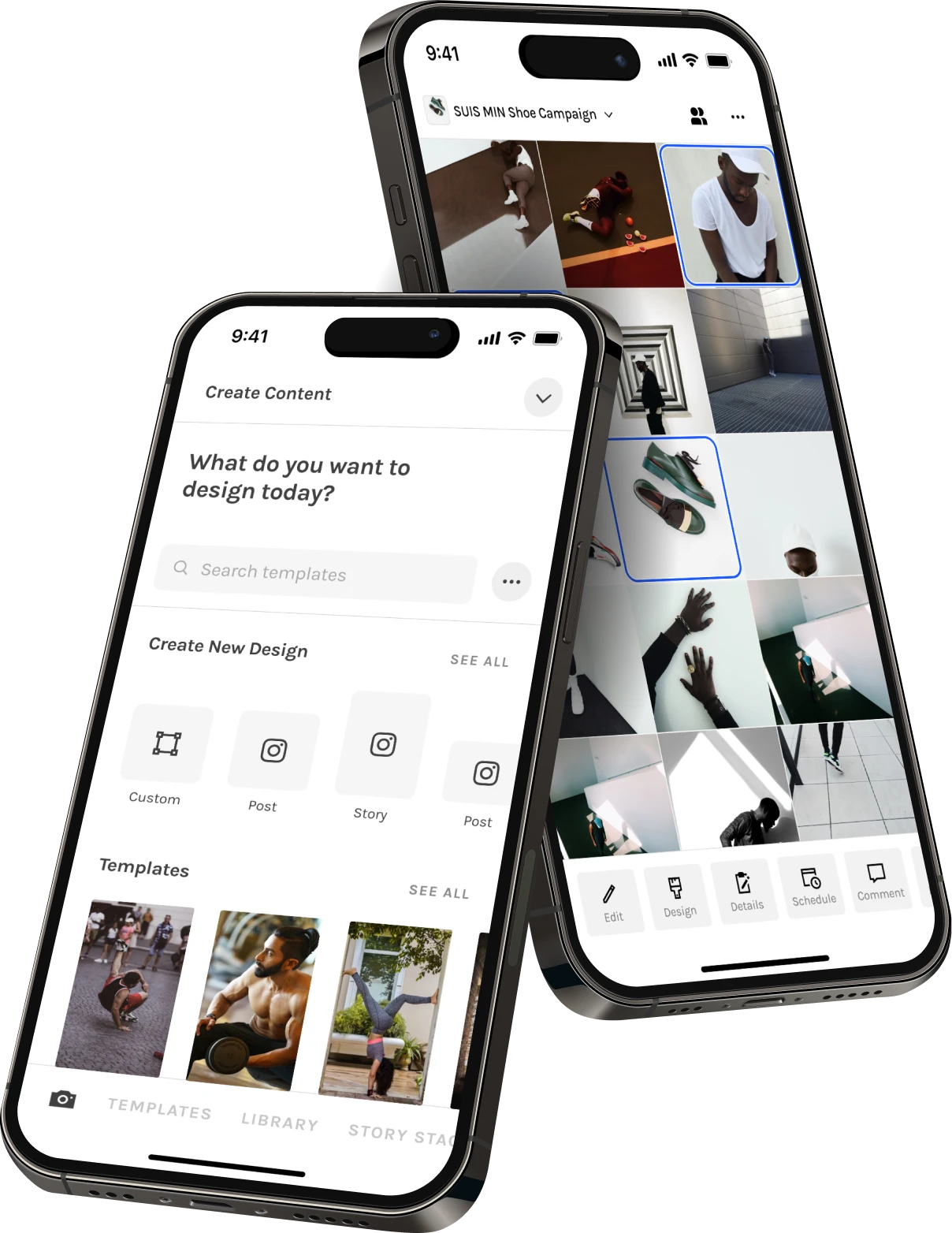
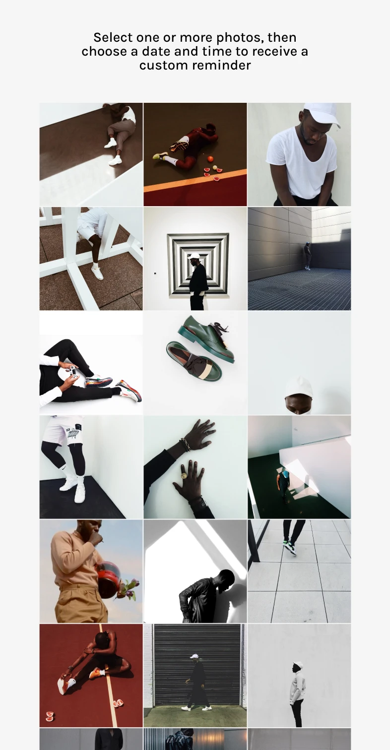
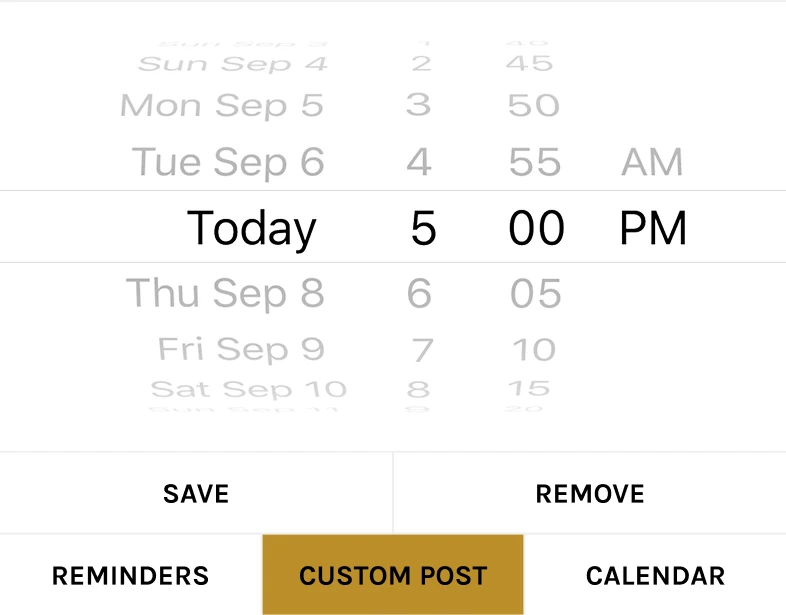
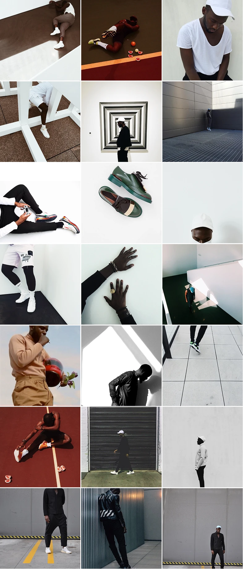
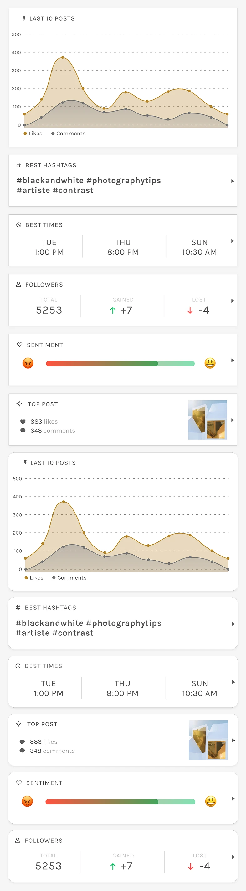
This project was a full app redesign focused on clarity and usability. We turned a cluttered, multi-tab experience into a unified, grid-based tool that made content planning feel natural. I led end-to-end product design, collaborating with the CEO, CTO, and engineers to rebuild the foundation and prepare for future features like StoryStacks.

My Role

Lead Product Designer

Partners

CEO, CTO, Engineers

Platforms

iOS, Android

Timeline

~3–5 months (2019)

How I redesigned an app that earned Apple's App of the Day

+28–35% feature usage
Ratings increased 3.7 to 4.2
Earned App of the Day by Apple

The product's core functionality was difficult to figure out.

The foundation was there — clean layout, clear intent, solid idea. But too many small UX issues layered on top of each other created friction. Each one alone was minor, but together they made the experience confusing.

App Store reviews consistently pointed to frustration and confusion. People saw the value in the app, but the experience got in the way.

From the App Store

I ran a UX audit to understand why users felt confused.

The foundation was there — clean layout, clear intent, solid idea. But too many small UX issues layered on top of each other created friction. Each one alone was minor, but together they made the experience confusing.

The foundation was there — clean layout, clear intent, solid idea. But too many small UX issues layered on top of each other created friction. Each one alone was minor, but together they made the experience confusing.

Custom Post
Analytics

Strategy

The foundation was there — clean layout, clear intent, solid idea. But too many small UX issues layered on top of each other created friction. Each one alone was minor, but together they made the experience confusing.

Clarity-by-design, not more tooltips.

Compare the designs.

The foundation was there — clean layout, clear intent, solid idea. But too many small UX issues layered on top of each other created friction. Each one alone was minor, but together they made the experience confusing.

Previous Design
New Design
Previous Design
New Design
Previous Design
New Design

The result is a better design.

The foundation was there — clean layout, clear intent, solid idea. But too many small UX issues layered on top of each other created friction. Each one alone was minor, but together they made the experience confusing.

From the App Store

Interested in working together?